


When you partner with AMUX for your site, you get more than a customized website. AMUX optimizes your site for local SEO so you show up where it counts. Get more targeted leads for your business.


Your viewers are seeing your site across a large variety of screens. Your site needs to be optimized for more than just a mobile view and desktop. Every website design package comes with optimization across four different screen sizes minimum.

This is best for businesses that are looking to get started with their online presence and their main goal is to get potential clients to reach out.
*Every site package comes with a Figma Prototype, UX Strategy, Keyword Research, Mobile Optimization, and ADA Compliancy.
This is ideal for businesses that have a lot of content, may need a blog, filter functions, quote generators, or other integrations.
*Every site package comes with a Figma Prototype, UX Strategy, Keyword Research, Mobile Optimization, and ADA Compliancy.
This is best for sites that will have an online store and checkout process, or a website that has client portals or member areas.
*Every site package comes with a Figma Prototype, UX Strategy, Keyword Research, Mobile Optimization, and ADA Compliancy.
AMUX Designs does customized site creations and redesigns.
You'll receive the quote within 24 hours Mon - Fri; quotes provided are good for 30 days.

Need help picking the option that suits your business best? Schedule a quick call and get your questions answered.
Schedule a Meeting

.gif)
When the user has a positive experience with a website design, they are more likely to stay on your website instead of navigating away.
.gif)
Google changed their algorithm in March 2024 to account for the Usability of a website. If your site provides poor UX for your users, you won't be pushed to the top of search results.
.gif)
Solid user experience on a site not only leads to more engagement from the user, but there is a significantly higher chance of the user completing the goal of your site.


You fill out a brief that tells me everything I need to know about your business, your target audience, and your market. This information allows me to create a strategic plan to maximize conversion on your website.
I review the information provided in the brief you filled out and any branding or website assets that are being used. I research your market and your target audience and create a plan based on that research.
Now it's time to implement the overall strategy into a website. This process begins with a wireframe and ends with a full prototype that allows you to see your website before we begin developing. This process allows us to make massive changes to create better flow, engaging user interface, and a clear user journey that guides the user to complete the goal of the website.
The visual analysis is the review of the prototype for the following:
After the approved prototype is developed, there's nothing left but to take it live and show it off.
Fill out a short form and get a quote within 24-hours (M-F).
All quotes are customized for your specific business needs and start from $1,500.

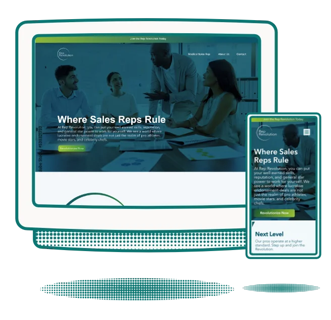
They needed to better communicate with their audience. Their site was riddled with user experience issues and confusing messaging. This lead to a high bounce rate, and low conversion rate.
I created a new landing page design that condensed long wordy paragraphs into call outs so the user could make better sense of what TipTree had to offer. I re-designed the overall flow of the site to guide the user into signing up for the platform, rather than overwhelming the user with too much information that wasn’t properly organized.
They performed an A/B test with my design and the previous and found a 22.6% increase in number of people who signed up for their platform in under 4 days time. This lead to them having me redo the user experience and the user interface of the dashboard within their platform as well. This is an on-going project.

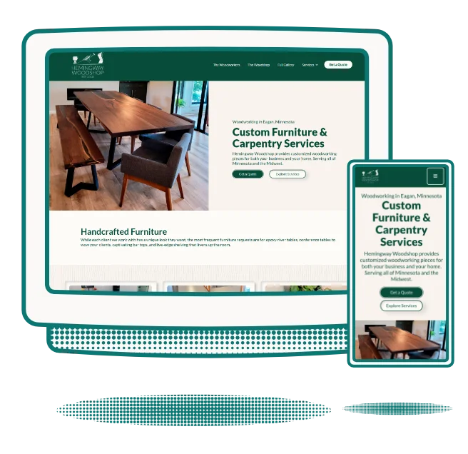
Their old site design focused too much on galleries. This lead to a slow site with low conversion and a lot of confusion. They wanted to showcase their work so it was simple for a customer to find samples of a specific project they are looking to request. They are a custom craft, which means they needed people to request a quote from their site. Their previous site, didn’t lead users to request a quote or a meeting which meant the site wasn’t doing its job.
I moved their site from Wix to Webflow to accommodate larger galleries without sacrificing speed. I then geared every aspect of the site to focus on simple navigation to find specific projects and put in project requests.
Since launching their new site back in October of 2023, they reported an increase in leads by 42% and reported a 39% increase in closing sales. They are now subscribers to my design subscription and we are working on the design of their retail shop, opening in spring, 2024.

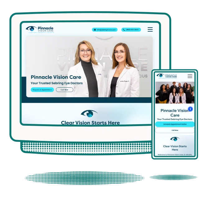
Their old site was created by Bullseye Media in Minnesota. It was riddled with both visual design errors and user experience errors. Their sales people reported visitors were confused by their site and didn’t understand the technology TheraTec had to offer.
I scraped the entire design created by Bullseye Media. Their new site design is branded properly and shows the technology they talk about, rather than showing images that had nothing to do with their business. We focused on providing information based on research to improve their conversion and the overall visual design. Their target audience: PT Clinicians.
This new site design was launched February 2024.

The main platforms I develop / build in are: Webflow, Wix, Wordpress, and Framer.
The choice depends on the necessary functionality of the website, integrations needed for the project, and if you require hosting or routine maintenanc.
Yes. The clients that require white labeling work typically sign up for a retainer package with me.
For service based sites, typically two weeks.
For e-commerce based sites, typically four weeks.
These timelines begin after the on-boarding call is complete and are also dependent upon the clients response time.
Anyone looking to get both a brand created and a website developed will get a 10% discount on a combination package.
User experience design is the study of how a user interacts with a physical or digital product. Studies show, users are more likely to invest in products / services from brands that invest in UX Design as it provides better usability and ease of use.
With a return rate of up to $100 for every $1 spent on UX - it's hard to argue against investing in UX.
Depending on your subscription, you can input one to two design requests at a time. If you have a large queue of design requests, you can input those ideas into the project management system, and we move through them as each request is completed.