
Client Work
January 2025
Brand Refresh
Web Design
Web Development
Adobe Creative Suite
Figma
Webflow

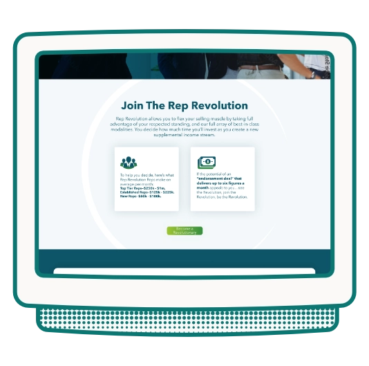
Brand Refresh: I established their brand colors as a deep blue and brighter green to signify a trustworthy and financially driven company. I utilized stock imagery of professional salesmen in a sales environment throughout the site to establish them as a professional in the medical sales world.
Web Design: Their website was a simple four page layout with the goal of getting users to email or fill out the form on their site. Their target audience is potential sales reps, so we made sure the information on the site surrounded the benefits of working with Rep Revolution.

Their logo utilized a circle symbol to reference the word "revolution". I added the colors to the logo and tapered off the ends of each of the circle to help give it a bit more depth. The circle is a symbol that is utilized throughout their website. I also created a few icons that fit this style to help pull out important information for the user to reference.


The owner of this company approved of the site and utilized me to complete a few other print marketing materials and a powerpoint they could use to help them convert those that expressed interest via the site. The site launched in January of 2025 and is self-managed.