Client Work
July 2023 - August 2023
Brand Development
User Research
Answer the Public
Adobe Creative Suite
Competitor Analysis: I saw a common theme with their competitors of utilizing a dull blue monochrome palette paired with a wordmark logo that lacked a symbol. This helped me identify the logo direction.
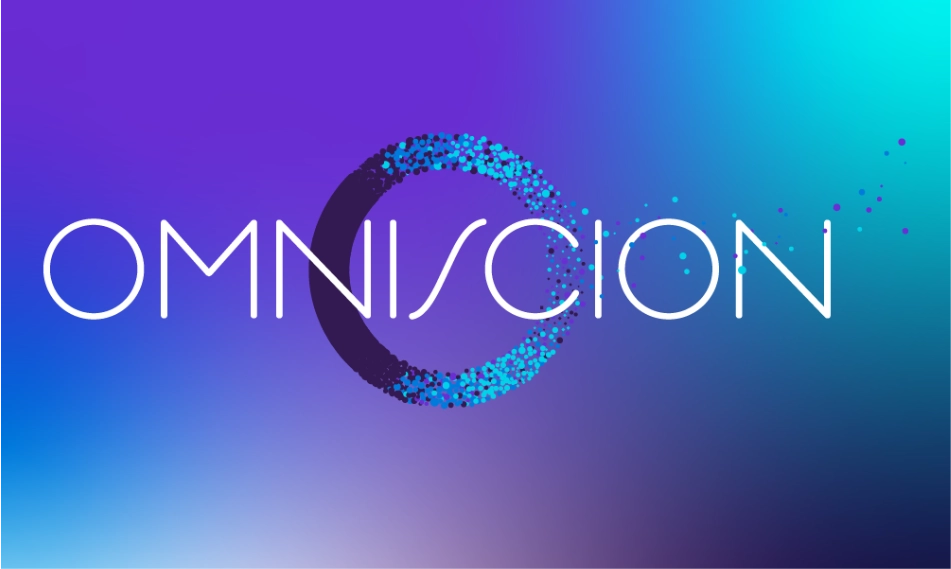
Brand Development: I created a bold teal and purple palette. This stood out among their competitors as bold and innovative. I created a mesh gradient that could be used throughout their brand easily and their logo was comprised with data points that meleded into one.

The data display style I used as inspiration for this logo design was a scatter plot chart. The data points in the logo meld into a solid object which represents the importance of gathering a vast amount of data points to create one solid idea or direction.


The final result was very well received by the people behind this data collection company and no alterations were needed.