
The graphic design subscriptions come with a wide array of design requests. I take care of anything from flyers and banners, to social media graphics and motion graphics.


There is no limit on the number of designs you may request each month. Each package allows for 1 - 2 design requests at a time, with a turnaround time that is typically 48 hours. If you have a lot of project requests, that you don't want to lose track of - you may put them into your Trello board and move them to the queue when each request is subsequently completed.
Turn around time is typically within 48 hours. However, for larger design requests, such as a 3D animation or a presentation that contains a large number of pages, this turnaround time will be added to the design request for approval. For larger design requests, I suggest allowing 5 - 10 days.
Your subscription comes with a members area that will give you access to your personalized Trello board.
Trello is a project management system that provides a smooth process from project submission, to edits, and completion. We are able to upload files related to each project directly into Trello, and can link in any integrations Trello allows and your team requires.
Once you sign up for your subscription, you will get a video tutorial that will show you how your Trello board works. Then we hop on our on-boarding call to discuss any custom integrations and questions you may have. Don't worry, I make sure you have a full understanding on how to take advantage of your subscription.
Yours truly.
I am the only designer behind AMUX designs, so you get to work with me directly.
Log in to your membership account by using the "Log In" link in the navigation bar of this site. When you log in, hit the button "pause membership". This will pause your billing cycle and design requests until you resume.

"The alternative to good design is always bad design. There is no such thing as no design."
- Adam Judge -


Privacy Policy
Effective Date: 02/13/2024
Thank you for visiting AMUX Design. This Privacy Policy outlines how we collect, use, and protect the information you provide to us.
1. Information We Collect We collect the following types of personal information:
Name, Email, Phone, Company Name, Website associated with the company, Billing Address
2. How We Collect Information
We collect information through the following methods:
Chat feature, Contact form, Purchase or subscription processes
3. Why We Collect Information
We collect information to:
Provide the services necessary to complete a project, Conduct marketing activities
4. How We Use the Information
We use the collected information to: Process orders, Set up customized client portals, Send promotional emails on occasion
5. Sharing of Information
We do not share or sell your information with third parties.
6. Security Measures
Your information is logged into the backend of our site, which is protected by Webflow.
7. User Rights
Users have no specific rights regarding their data.
8. Data Retention
We retain data for up to two years or as long as the user is subscribed.
9. Cookies
We utilize cookies in the chat widget provided by HubSpot.
10. Compliance with Laws
We comply with applicable data protection laws and regulations.
11. Children's Privacy
We do not collect information from minors.
12. Contact Us
For privacy concerns or inquiries, you may contact us via our contact form.
Changes to Privacy Policy
We may update our privacy policy from time to time. Please review this policy periodically for any changes.

Terms of Service
Effective Date: 02/13/2024
1. Overview Welcome to AMUX Designs! Our website showcases our design work and offers subscription services as well as website design and branding packages. By using our website or purchasing our services, you agree to comply with the terms outlined below.
2. Access and Use Our website is accessible to anyone for viewing and purchasing. User interaction functions are not available on our site.
3. User Accounts Users may sign up for a free account to access their portal. Paid subscriptions grant access to gated content.
4. Ownership and Use of Content We own the site and its content. Users may not use the content on our site.
5. User-Generated Content (UGC)There is no user-generated content on our site.
6. Third-Party Links Links leading to third parties showcase our work or tools used for order fulfillment.
7. Warranties and Guarantees We do not provide warranties. Our guarantee is to deliver professional services in a professional manner.
8. Data Handling User data is stored on the backend of our site.
9. Refunds and Cancellations No refunds for services. Subscribers may pause or cancel their subscription at any time. Website design or brand identity packages are final purchases with no refunds.
10. Conflict Resolution Conflicts will be handled in-house. Disrespectful or rude behavior may result in discontinuation of services. Legal action may result in the client covering incurred legal fees if we prevail.
11. Liability We are not liable for plagiarized information or images provided by the client. All work provided is custom or uses properly licensed images.
12. Changes to Terms of Service We reserve the right to make changes to our Terms of Service. Users will be informed via email if changes occur.
13. Contact Us For any questions or concerns regarding our Terms of Service, please contact us directly.
"The alternative to good design is always bad design.
There is no such thing as no design."
-Adam Judge-


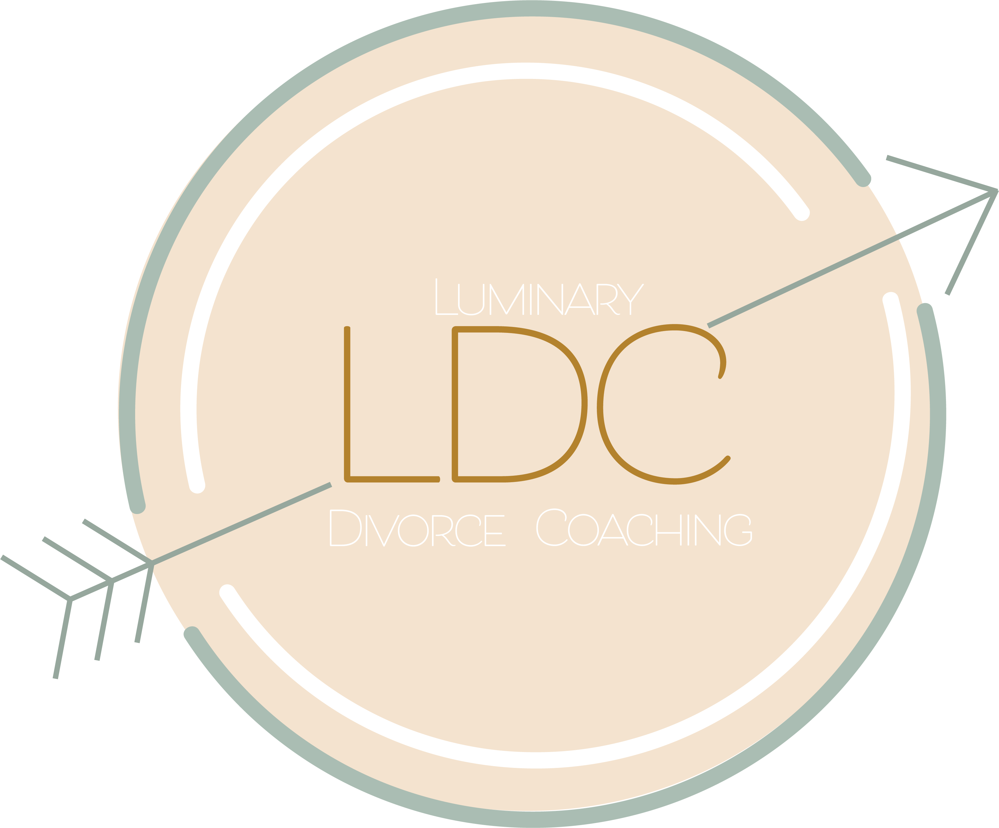
LDC wanted a brand that was light, and brought her clients a sense of calm. The inspiration for the logo and the patterns came from our discussion about why she started this business. She told me a story about her grandmother, and how she believed in order to move forward, sometimes we have to pull back.
This inspired my idea of using the arrow as the main symbol of her brand.


REMastered Sleep wanted a brand that was bold and attention grabbing. This lead to the gradient used across their site and their marketing materials.
Their site and social media needed to incorporate a lot of educational graphics to demonstrate why REMplenish is so effective in alleviating snoring and improving overall airway health.


LDC wanted a brand that was light, and brought her clients a sense of calm. The inspiration for the logo and the patterns came from our discussion about why she started this business. She told me a story about her grandmother, and how she believed in order to move forward, sometimes we have to pull back.
This inspired my idea of using the arrow as the main symbol of her brand.


Violet House needed a brand that was earthy and natural.
Due to the name, I wanted to incorporate both the color violet, and the flower.
I used Adobe Fresco to create the flower illustrations and the patterns used throughout the brand. The dark green brings great contrast to the brand to allow the illustrations to pop.


Eli Patterson was looking to start up a food truck that served the Colorado Springs area with the best wings in town. He needed a full brand identity, truck wrap design, menu designs, and website design.
I was the lucky designer who got to bring the incredibly fun brand to life. I utilized the entire adobe suite and wix to get this project up and running.


Eagan Wave Soccer Club was in need of a logo redesign. Their initial design was a badge shape which they wanted to keep for easy use on jerseys and other marketing items players may want. After the shape was solidified, the other items that were a must for them was having a soccer ball, the words "Wave SC", and the Minnesota State shape.
After playing with a few ideas, I pitched the idea of having the soccer ball pattern in the background and making that their main brand pattern. This helped keep the logo clear, and more importantly less cluttered while maintaining the other more important aspects of their requirements.


Rachel Snow wanted a brand that was light, clean, and had a clear vision that spoke to her goal of bringing clients "into the light". The inspiration for this brand was immediate following our initial brand discovery call. She told me a story about her grandmother, and how she believed in order to move forward, sometimes we have to pull back.
This inspired the idea of using the arrow as the main symbol of her brand. The color palette was drawn from the colors that can be seen in a photo of the Colorado sunrise, which is the location of her business. The brand fell into place quickly after finalizing these details.


Hemingway Woodshop wanted a clean cut brand with an earthy color palette. They sell handmade custom furniture for both home and businesses. They work with a large variety of wood and wanted to show creativity, humor, and their talent.
In order to communicate the keyword "handmade", I went with a hand planer as their brand icon. This style of illustration highlighted simple line work and texture that complimented the main keywords of their brand. This lead to an illustration bank that riddles their website in custom creativity.

I am a passionate branding specialist. Branding is much more than a simple logo and color palette. It's an identity. It's the story you mean to tell. It's how you communicate to your audience. It is the most important aspect of your business and it deserves the greatest attention to detail. I take special interest in your passion for your business and your market to bring your vision to life.
Get A Quote